Design Journey
A training program on cognitive ergonomics, language, visual design and data visualization for the teams of one of Italy's largest banking groups, built to raise the quality of their reports, dashboards and internal communication.
- Role
- Design Lead & Trainer
- Year
- 2023

Design for people who write reports
Design Journey is a design course for the teams of one of Italy's largest banking groups. Its participants are analysts and specialists who never studied design, yet spend their weeks producing reports, dashboards and presentations that other people use to make decisions.
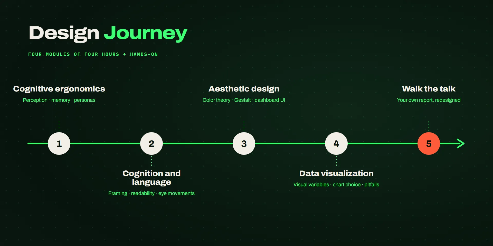
The course follows the path a piece of information takes to reach someone: how we perceive it, how we read and understand it, how layout and color guide the eye, and how data becomes a chart. Each module mixes theory, short exercises and hands-on work, and a final stage applies everything to the participants' own documents.
Dense reports, little time to read them
The bank's teams produce a large amount of analysis: portfolio monitoring, sector reports, credit updates. The content was solid, but the documents were hard to read. Pages packed with tables, charts chosen by habit, titles that described the data without saying what it meant. The people receiving them often had a few minutes to decide. The course had to:
- Start from how the mind works, so every guideline comes with the reason behind it and people can apply it to cases the course never covered.
- Speak to non-designers, with plain language, everyday examples and no design software.
- Make it active: short experiments in every module, where participants fall for an illusion or a bias before it is explained.
- Give tools for the daily work: frameworks for writing, rules for layout and a method for choosing a chart.
- End on real documents, redesigning the reports the teams actually send.
Five stages
I designed the program and delivered it with a designer from my team. The four theory modules last four hours each, with a hands-on part, and a shorter format, Design Pills, condenses them for wider audiences.
Cognitive ergonomics
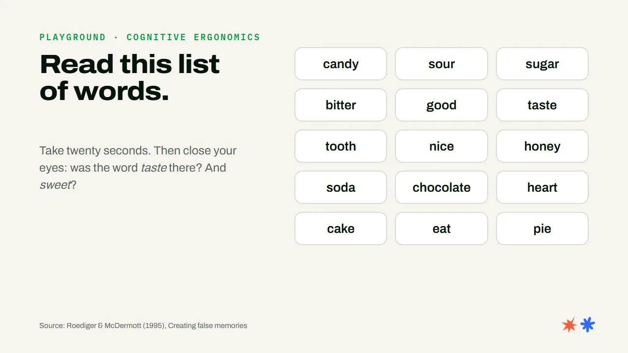
How we perceive, learn and remember, and why that matters for interfaces. Affordances, mental models, primacy and recency, and the false memories a list of words can create. Then user-centered design: requirements ranked with MoSCoW, personas, scenarios and prototypes.
Cognition and language
How the wording of a sentence changes the decision it leads to. Framing, presuppositions and implicit messages, the EAST framework for messages that get read, readability measured with the Gulpease index, and how the eyes move across a page or a screen.
Aesthetic design
Color theory from the eye to the screen, color coding for categories and quantities, color blindness and rainbow scales. The Gestalt principles, typographic hierarchy, Miller's law, and how a moodboard, a brand book and a design system keep documents consistent.
Data visualization
From data to image: types of data, visual variables and pre-attentive processing, Tufte's principles, and the difference between a chart and a visualization that states its message. A catalog of honest charts and the most common ways charts mislead.
Walk the talk
The teams bring their own reports and redesign them with the course's method, from requirements and personas to the final layout.
Principles for everyday documents
Each module is built around a handful of laws and principles from psychology and design research. Every one comes with an exercise and a concrete use in a report or a dashboard.

Takete and Maluma
Asked which shape is called Takete and which Maluma, almost everyone gives the same answer. Shapes carry meaning before any explanation, so the course opens with this question and the symbol of the program comes from it.
- Module
- Cognitive ergonomics
- Source
- Köhler, 1929 and 1947
- Use it for
- Icons, buttons, tone

Affordance
An object should show how to use it. In a dashboard, what can be clicked has to look clickable, and what can't should never pretend to be.
- Module
- Cognitive ergonomics
- Source
- Norman, 1988
- Use it for
- Links, filters, controls
Framing effect
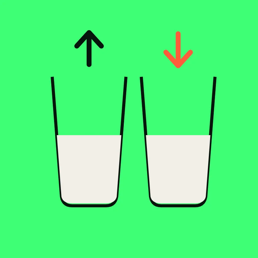
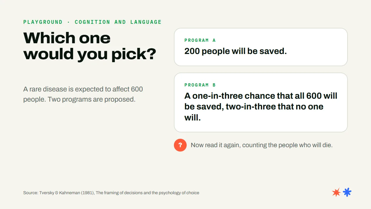
The same figure, described as a gain or as a loss, leads to different choices. Choosing the frame of a title is a decision, and the course treats it as one.
- Module
- Cognition and language
- Source
- Tversky & Kahneman, 1981
- Use it for
- Titles, key messages

EAST framework
Messages work when they are easy, attractive, social and timely. Four checks to run on any internal communication before sending it.
- Module
- Cognition and language
- Source
- Behavioural Insights Team, 2014
- Use it for
- Emails, internal news

Readability
Short words and short sentences make a text easier to read, and the Gulpease index measures it for Italian. Participants scored their own paragraphs and rewrote them.
- Module
- Cognition and language
- Source
- Gulpease index, 1988
- Use it for
- Report text, notes

Proximity
Elements close to each other are read as a group. White space does the work of borders and boxes, and makes the structure of a page visible at a glance.
- Module
- Aesthetic design
- Source
- Wertheimer, 1923
- Use it for
- Layout, tables, legends
Miller's law
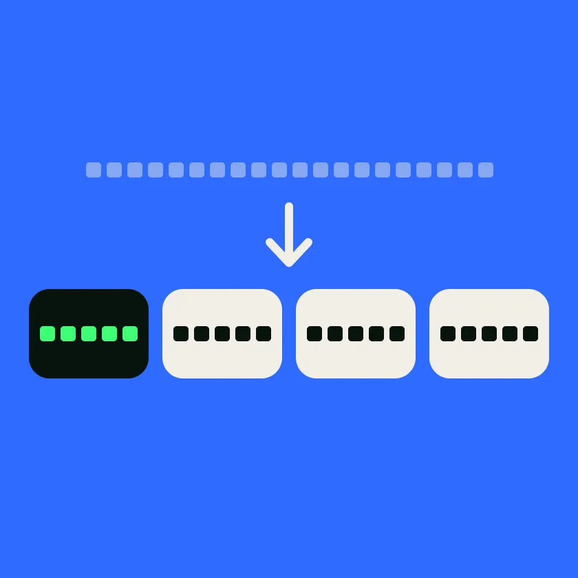
Short-term memory holds only a few items at once. The rule of thumb from the course: no more than five elements at each level of a page.
- Module
- Aesthetic design
- Source
- Miller, 1956
- Use it for
- KPI rows, menus

Simultaneous contrast
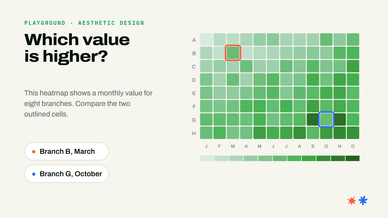
A color changes with the colors around it. Two identical cells in a heatmap can look different, so scales and backgrounds have to be chosen with care.
- Module
- Aesthetic design
- Source
- Chevreul, 1839
- Use it for
- Heatmaps, color scales
Visual variables
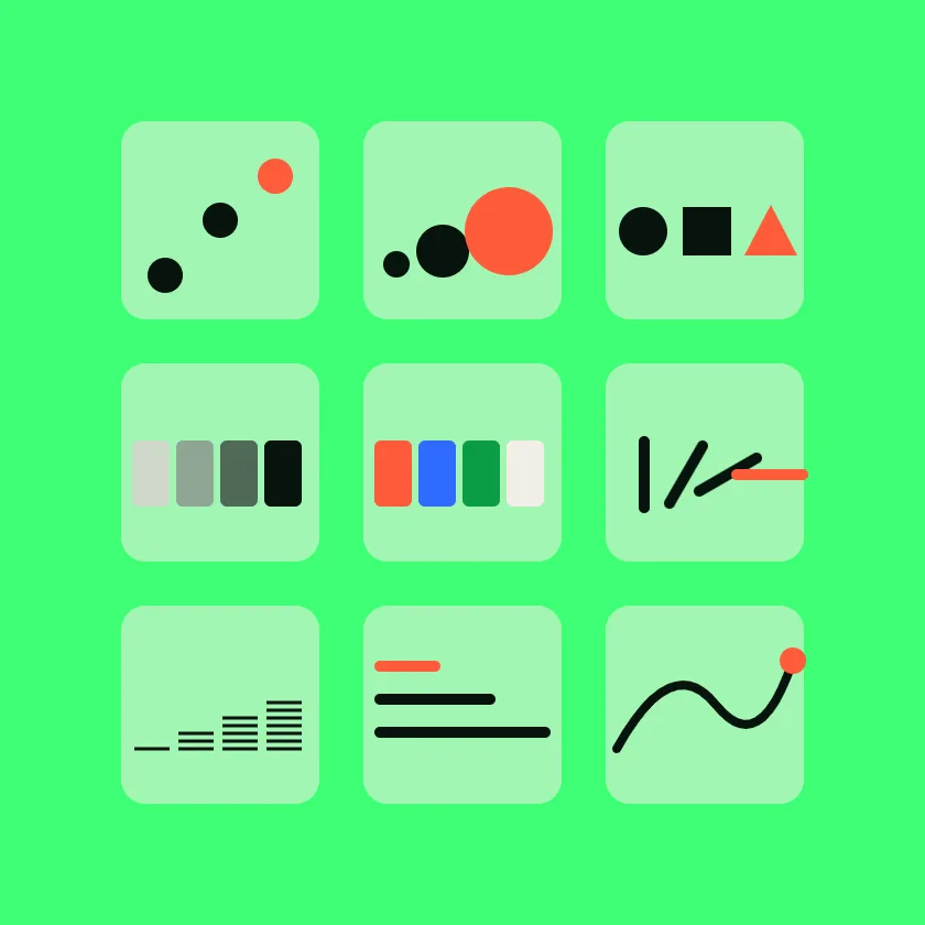
Position, size, shape, value, color, orientation and texture each encode data with a different precision. Picking the right one comes before picking the chart.
- Module
- Data visualization
- Source
- Bertin, 1967
- Use it for
- Choosing a chart
Pre-attentive processing
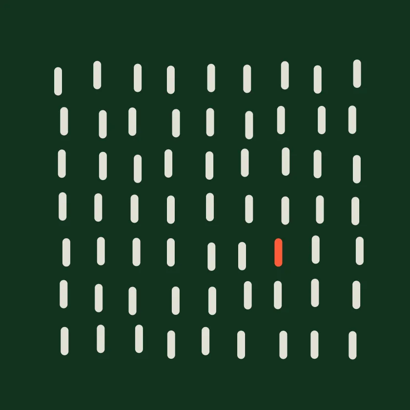
Some differences are seen before we start looking for them. One color used sparingly points the reader to the one number that matters.
- Module
- Data visualization
- Source
- Treisman & Gelade, 1980
- Use it for
- Highlights, alerts
Lie factor
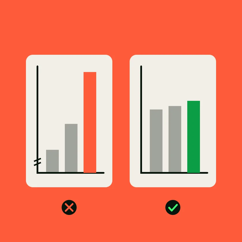
A chart lies when the size of the effect it shows differs from the size in the data. Cut axes, areas and 3D pies are the usual suspects.
- Module
- Data visualization
- Source
- Tufte, 1983
- Use it for
- Axes, comparisons
Learning by falling for it
Every module has a playground: a short experiment where the class answers a question, gets it wrong, and only then sees the principle behind it. A heatmap where two identical cells look different, a list of words that plants one that was never there, a choice that flips when the same numbers are framed as losses.
Walk the talk
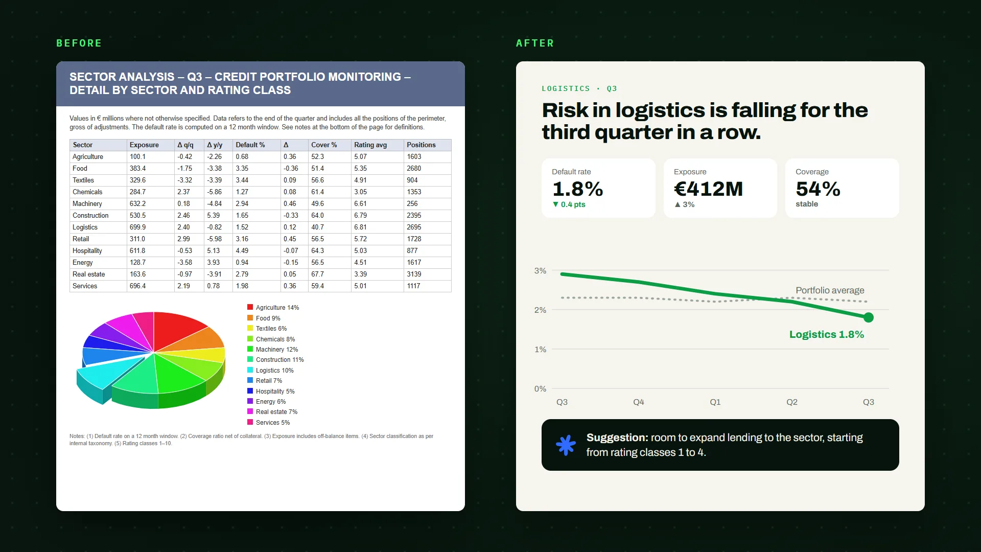
In the last stage the teams worked on reports they had already published, such as sector analyses and portfolio monitoring. Each group followed the same steps on its own document, then rebuilt its pages.
Requirements
The content of the report ranked with MoSCoW: what the reader must have, should have, could have and can wait for. An explicit suggestion to the credit teams came out as a must.
Personas and scenarios
Who reads the report, where and for how long. A manager who skims it in thirty minutes before a meeting, a branch officer who reads it online before a credit request, a specialist who looks for the detail of one sector.
Card sorting
The concepts of the report written on cards and grouped by the team, to find an order that matches how readers look for information.
Restyle
A title that states the message, a few numbers that matter, one chart chosen for the data, and the suggestion at the end of the page.
A shared language for documents
Design Journey gave the bank's teams a common vocabulary and a method for their documents, from the first requirement to the choice of a chart. The final stage turned it into redesigned reports, and the course material stays with the teams as a reference for the next ones.