Spendscape
A family of three analytics web apps for one of the world's largest payment networks: two on tourism spending and one on merchant payment performance. I designed the interfaces and led the team that built and ran them.
- Role
- Design Lead & Project Manager
- Year
- 2025

Payment data, made readable
Every card payment says something: where it happened, how much was spent, in which category, and whether it was approved. One of the world's largest payment networks wanted to turn that data into products its own business customers could open every morning and act on.
Spendscape is the family of three web dashboards I designed and delivered for them: two on tourism spending and one on merchant payment performance. They serve more than 500 users across more than 30 markets, and they have been updated every week since launch.
Three products, one team
The dashboards answer different questions for different people. A regional tourism board wants to know who is visiting and what they spend on; a merchant's payment team wants to know why transactions get declined. The work, across a budget of more than €2M, had to:
- Make dense data readable for people who are not analysts, with every metric explained where it appears.
- Speak one language across products, so a user moving from one dashboard to another finds the same filters, cards and charts.
- Make comparison easy: against the previous year, between destinations, and against market benchmarks.
- Respect data access: each user sees only the territories or merchants they are entitled to, managed from an admin area.
- Ship every week without breaking the views clients rely on daily.
- Run three products in parallel with teams totalling more than ten people.
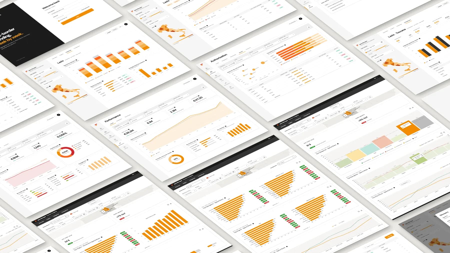
Three dashboards
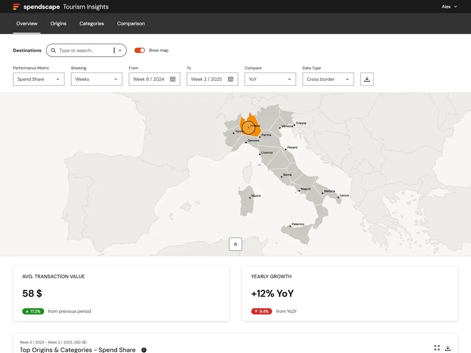
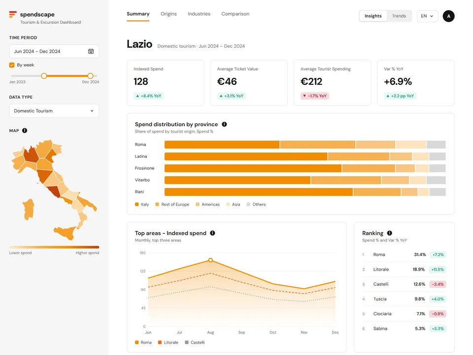
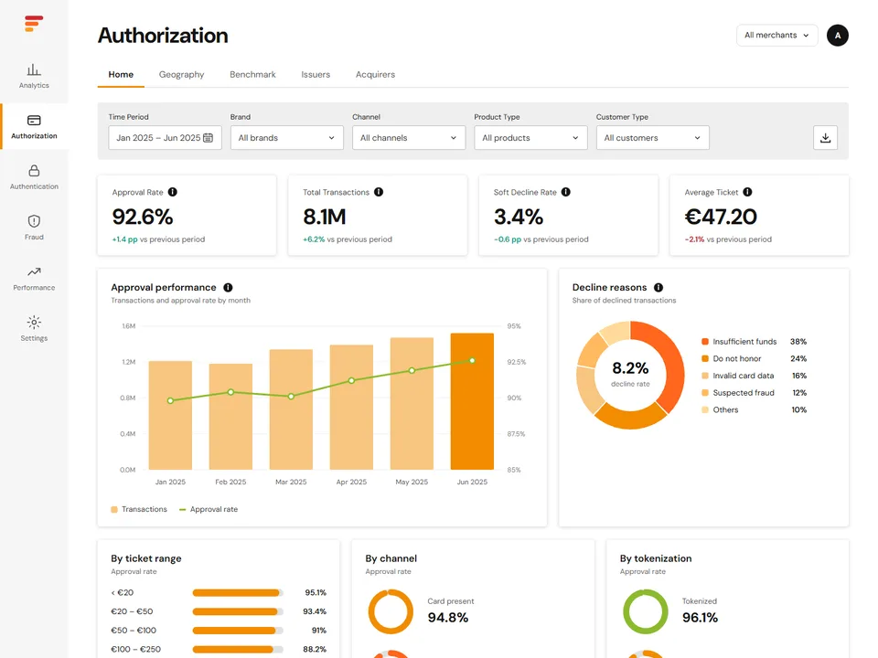
Each product has its own audience and structure, built on the same set of components.
How I led the team
I designed the interfaces myself, working closely with the client's business teams and stakeholders, and led development from the first workshop to the weekly release. Each discipline had a clear place in the process.
Product design
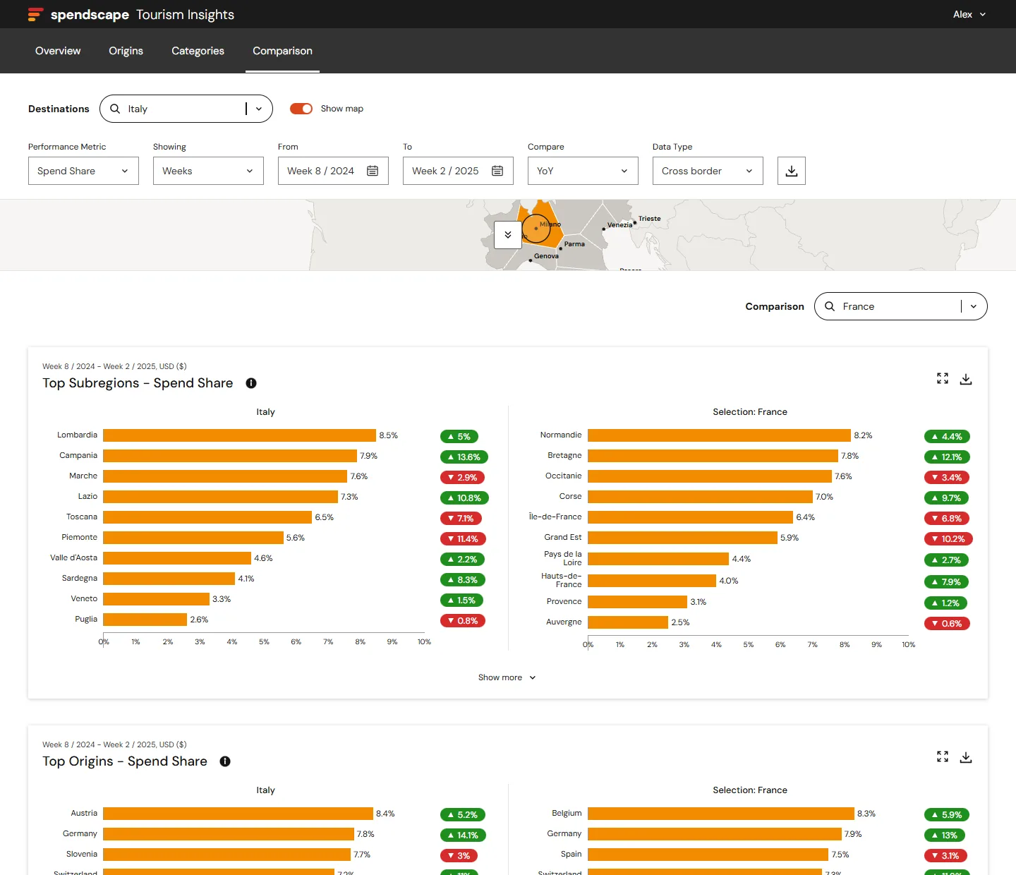
I owned the interfaces and the shared component kit: filter bar, KPI cards, chart cards, variation pills. Every new view started from those pieces, so design stayed consistent across the three products.
Full-stack development
The developers built the front ends and the APIs behind each chart. I reviewed every feature against the design before release and kept the backlog ordered by what clients needed next.
Architecture and DevOps
Cloud infrastructure with separate staging and production environments and automated pipelines, the base that made a weekly release routine.
Data analysis
The analysts defined how each metric is calculated. Together we turned those definitions into the tooltips and glossary users read next to every chart.
Quality
Automated tests and code quality checks ran on every change, and each release went through staging before production.
Client and business
I ran the relationship with the client's business teams: workshops, priorities, demos and release notes, translating requests into scoped work for the team.
From brief to weekly release
Workshops with the business
Each product started with sessions with the client's business owners: who the users are, which questions they need answered, and which metrics answer them.
Wireframes on a shared kit
I sketched the views with the components the products share, so discussions focused on content and order, while the look was already settled.
Metrics defined with the analysts
Before building a chart, the team agreed on its formula, period and comparison. The same definition fed the API, the chart and the explanation shown to users.
Sprints and weekly releases
Work ran in sprints across the three products. Every week a release went from staging to production, with notes for the client's teams.
Feedback into the backlog
Requests from users and business owners went back into a single backlog, ordered with the client and planned into the next sprints.
Design decisions
The products are used to make decisions quickly, so every choice aims at reading the right number at a glance.
Jakob's Law
Users spend most of their time in other products. Inside Spendscape, filters, cards and charts work the same way in every dashboard, so what users learn once applies everywhere.
Law of Common Region
Every chart lives in its own card, with the period, currency, info and download actions in its header. What belongs together is grouped together.
Von Restorff Effect
The selection is the only element in full orange: the region on the map, the highlighted bar. Everything else stays muted, so the eye goes straight to it.
Law of Similarity
Every variation uses the same pill, green and pointing up when it grows, red and pointing down when it falls, wherever it appears.
Miller's Law
Rankings show the top ten and a "Show more" link, and the map collapses into a thin strip once a destination is chosen, leaving room for the charts.
Tesler's Law
Some complexity has to live somewhere. Definitions live in tooltips and a glossary, one click away, instead of crowding the charts.
Three products in production
Today the three dashboards are in production for more than 500 users across more than 30 markets, built on one shared set of components and updated with a release every week. A new view starts from pieces the team already knows, and a new metric goes from definition to chart through a process everyone on the team follows.